
 Copy Link
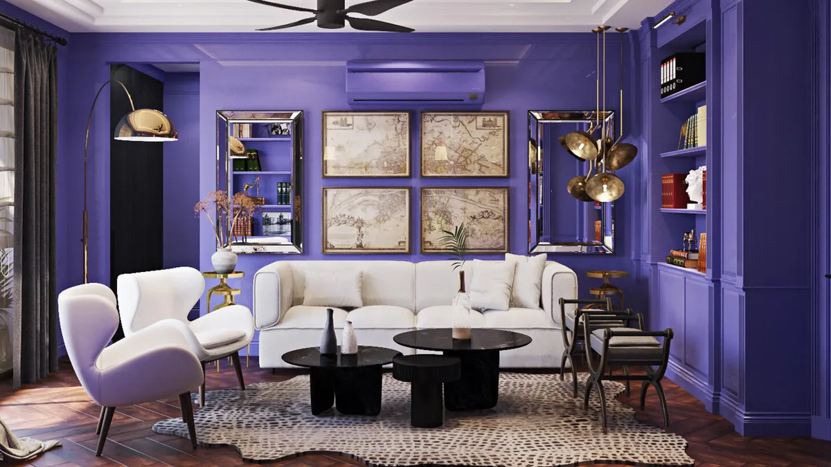
As we bid adieu to 2021 and welcome 2022, it is time to embrace new beginnings with renewed vigour. If you are looking at a home makeover to shake things up and start the new year with a new look for your abode, the Pantone colour of 22 is perfect to add a touch of playful freshness to furnishings, accessories, artefacts, and a lot more. Reflecting the global mood and expectations from the new year, Pantone this time has gone all out and created a brand-new colour, Very Peri, which has been designated as the colour of 2022. ‘PANTONE 17-3938 Very Peri’ as described by the company is “the happiest and warmest of all the blue hues and introduces an empowering mix of newness”.
A synthesis of energy and excitement
A symbol of transition, high spiritedness, and joy—Very Peri has been described by Pantone as “a dynamic periwinkle blue hue with a vivifying violet red undertone that blends the faithfulness and constancy of blue with the energy and excitement of red”. It exudes a sense of hope, buoyancy, and optimism that is much needed and expected from 2022. “The desire and compulsive feeling to overcome the Covid-19 pandemic, and the latest havoc of environmental concerns in our current world lend support to the formulation of Very Peri which stands tall to be a joyous and dynamic colour,” says Abhijit Roy, MD & CEO, Berger Paints India Limited.

A perfect synergy of two diametrically different shades, Very Peri is a colour that sparks both curiosity and creativity which is ideal for the transformative times we live in as we navigate the phygital world. A millennial tone that is completely refreshing, Very peri inspires innovation and brings in an element of novelty.
Elements of playful freshness
_1640620966036.jpg?w=800&f=webp&t=ec4cd6507aba7009)
When it comes to home decor, Very Peri is the perfect hue to add a pop of colour to an otherwise neutral space or muted colour palette. An ideal way to add an element of surprise, it is a great idea to introduce it on an accent wall or as a statement colour in the foyer area or hallway. “A Very Peri painted wall would make for quite an eclectic backdrop for a family room. It can be paired with furniture in neutral shades with cream and ivory accents to create an effortlessly modern look. For bolder homeowners, a dramatic entrance foyer in Very Peri can be an interesting option as it is a colour which, when well-lit, can brighten a space and when dimly lit can add drama to the setting,” says Sanjana Lunia, founder of Eris Home.
A unique shade that looks purple in a bright setting and a deep blue in a dim space, Very Peri is a colour that lends invigorating as well as serene vibes to a space. “Very Peri can be a distinguishing colour in your interiors. Whether you want to add a powerful pop or create an understated and subdued look—it can be both bold and neutral, bringing in a unique personality to any space,” says Paushika Gupta, founder of Paushika Gupta Architecture + Design.
Ideas aplenty
Given that this colour can be both raw and luxurious, makes it extremely versatile and a treat for home décor enthusiasts. From furnishings, artefacts, artwork to even fresh flowers—the colour can enliven the space almost effortlessly and in a jiffy. “The door of the living room painted with Very Peri can create a welcoming backdrop while pairing a Very Peri painted wall of your bedroom with soft-white bedding will bring out comforting and calming vibes. Being a multifaceted shade, Very Peri is suitable to use in different materials, textures, and finishes of interior and exterior design,” adds Abhijit Roy.

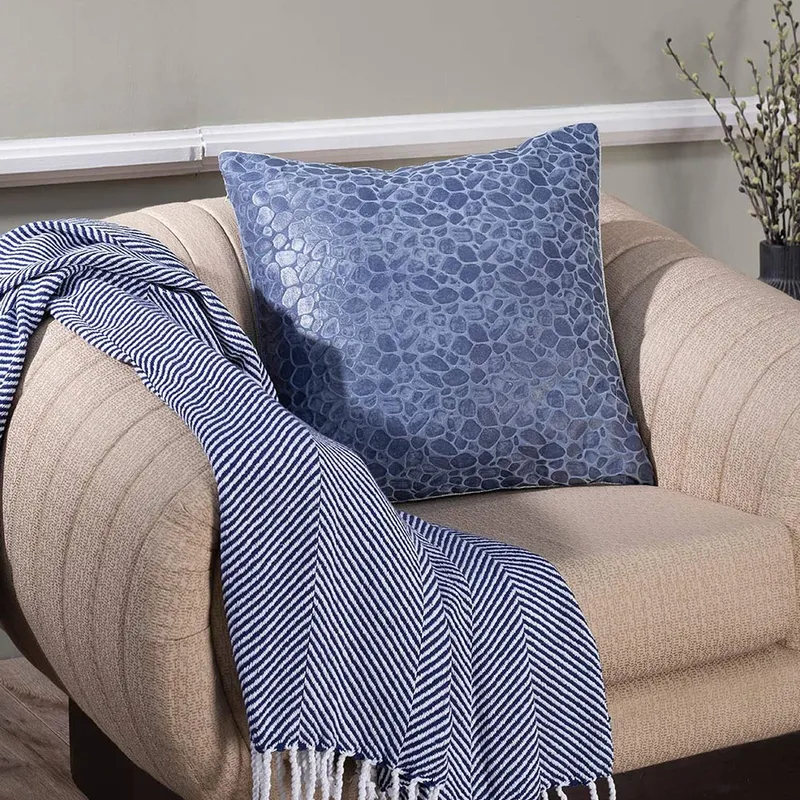
For your living area, consider throws, plush cushion covers, or even rugs dipped in Very Peri while combining it with whites, grey, and taupe for an elegant look and understated luxury. A wonderful colour for furnishings, it works well on velvets and/or silks as the sheen on these fabrics goes very well with the shade. “For the home office setting, you can add curios like a vase or a mood board in this shade. A splash of this cool colour on the walls will help boost productivity and creativity,” says Saloni Khosla, head- Spatial Design at Pepperfry. For the bedrooms, you can opt for pillowcases or a textured headboard in this shade to add contrast against white, cream, or ivory sheets.
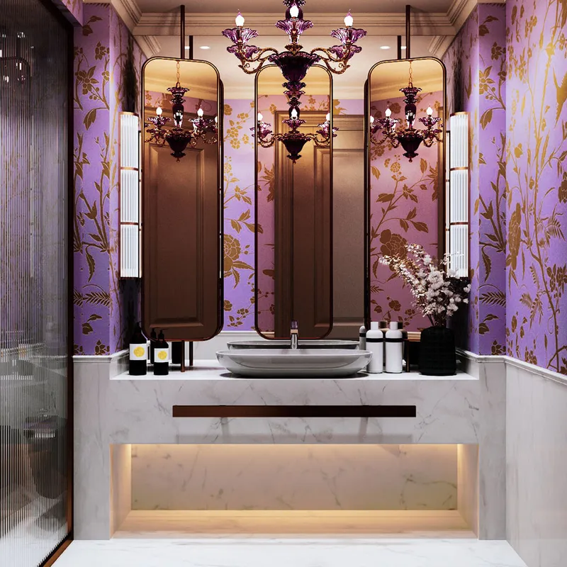
“Consider using this colour in the foyer by pairing a beautiful Very peri wall with a dramatic pattern on the floor, perhaps in black and white, to create a bold look,” adds Paushika Gupta. In the dining space, the shade can be paired with grey, black, and even green by using it in table linen. “Add this colour to the overhead cabinets in your kitchen—this will offer character and charm without taking over the space. Enhance this look by adding wooden handles. You can also add the kitchen bar stools that are upholstered in this colour,” adds Saloni Khosla.
A rustic coffee table painted in Very Peri is sure to add a charm quite like none other to your patio. Irrespective of the space or your décor aesthetic, simple additions like a bunch of fresh flowers—think lavender sticks, alliums, and bellflowers—never fail to add a touch of magic!

_1640620985991.jpg?w=800&f=webp&t=8053aa42fd40955a)
Dos and don’ts
|